WIN SCHOOL
EDUCATION
BRAND IDENTITY
SHAPING FUTURE WINNERS
PROJECT SHEET
Client
WIN SCHOOL
Industry
EDUCATION
Project Type
BRAND IDENTITY
Discipline
Logo DesignBrand Style DirectionColor SchemeTypographyPrint and Marketing Collateral
©LAPOMPS Studio.
EDUCATION
BRAND IDENTITY
PROJECT SHEET
Client
WIN SCHOOL
Industry
EDUCATION
Project Type
BRAND IDENTITY
Discipline
Logo DesignBrand Style DirectionColor SchemeTypographyPrint and Marketing Collateral
Inspire, educate, and prepare students to thrive as confident, skilled individuals who will shape the future with excellence
Project type:
Early childhood education and school branding
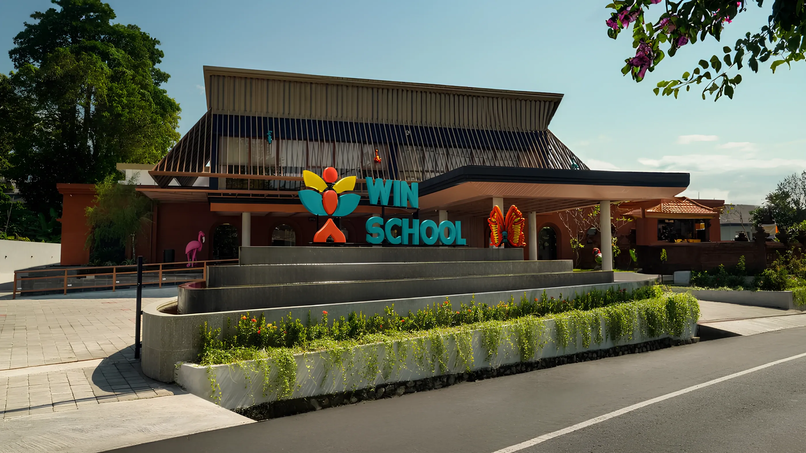
As a leading early childhood education center in Bali, WIN School focuses on nurturing young minds through a holistic approach, fostering creativity, curiosity, and confidence in every child. With such a strong, forward-thinking vision, we knew the branding had to reflect these core values, so we put a lot of thought into designing something that truly speaks to their mission and connects with their message.
Our brand reflects the core values we stand for: growth, curiosity, joy, and the spirit of learning.
Through thoughtful visual identity and design, we strive to embody the heart of Win School: a place where young minds are nurtured, dreams are sparked, and every small “win” is celebrated.
Through thoughtful visual identity and design, we strive to embody the heart of Win School
Win School: a place where young minds are nurtured, dreams are sparked, and every small “win” is celebrated. For the logo, we wanted to represent the journey toward success in a way that was both meaningful and modern. The sun as a symbol of bright future, lotus represents educational wisdom, a kid’s joyful jump, and trophy as an icon of victory come together to tell a story of triumph, reflecting the hope that WIN School’s students will grow as winners in their respective fields.
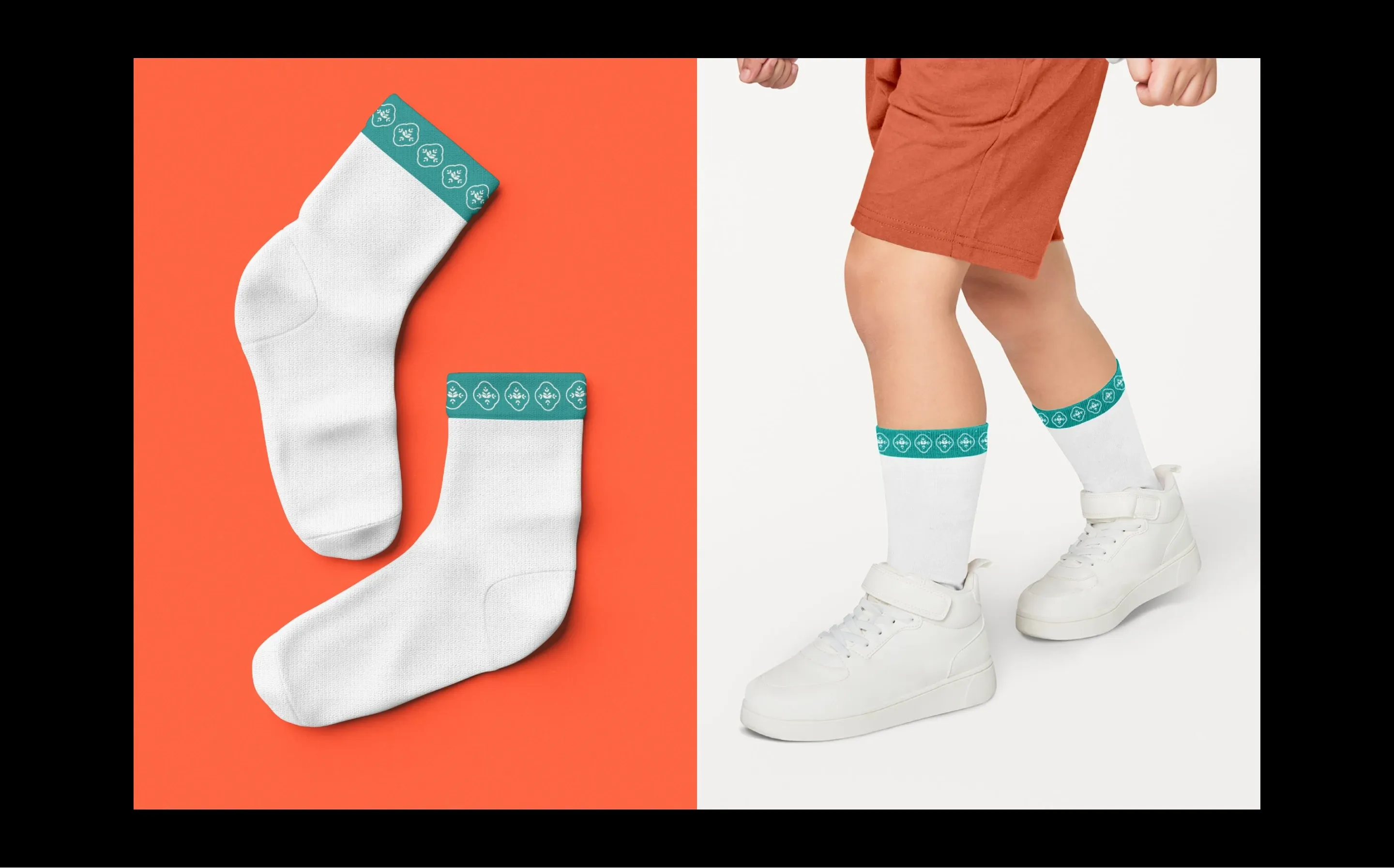
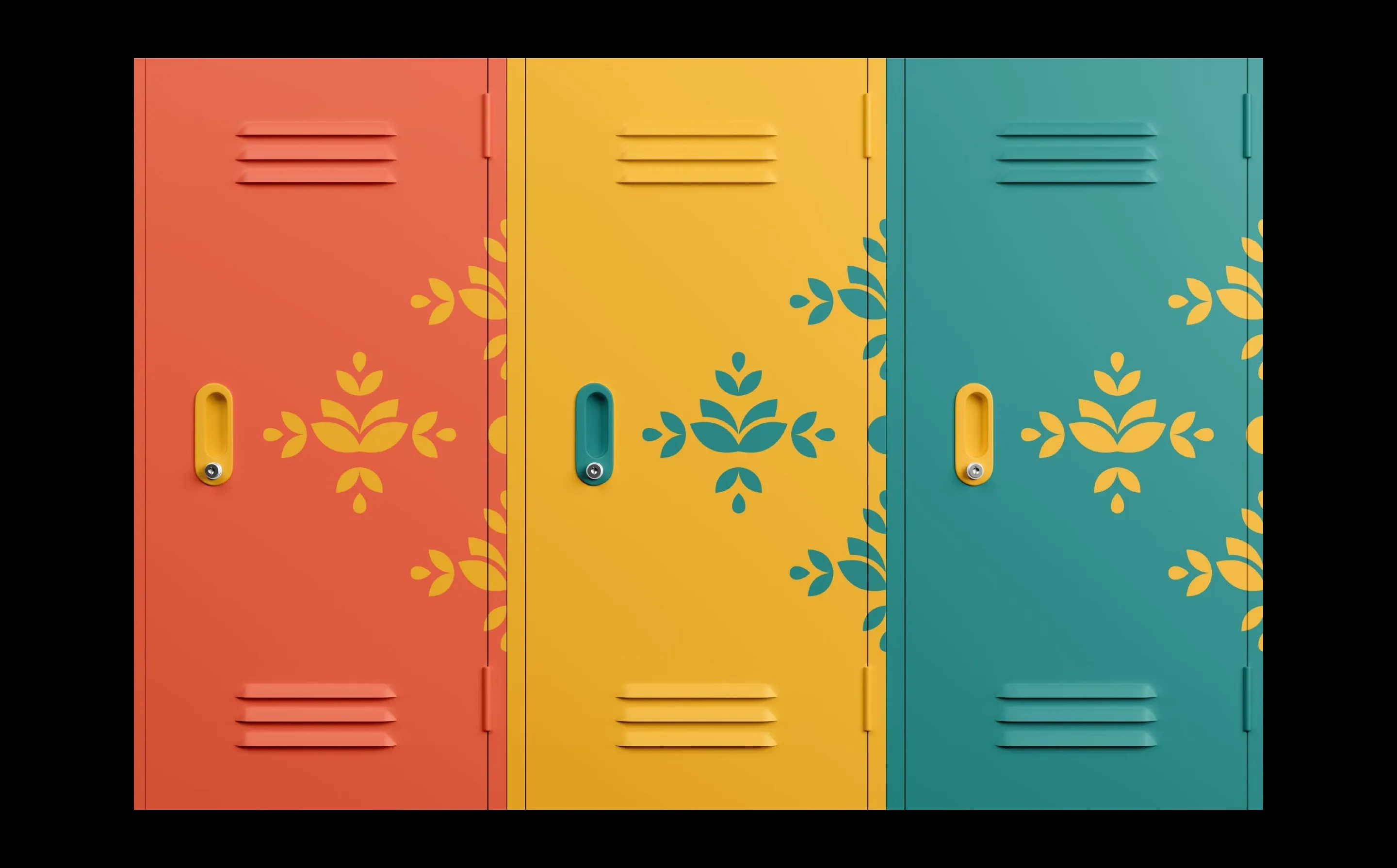
The repeated pattern resembles Balinese textile or batik designs, often featuring symmetrical floral elements to represent nature and harmony symbolizing the blooming of student potential, growth in knowledge and character. The use of tosca as the primary color adds depth to the branding, symbolizing emotional stability, calmness, and patience. Known for its ability to soothe the nervous system, improve focus, and inspire confidence, this color ties everything together perfectly.
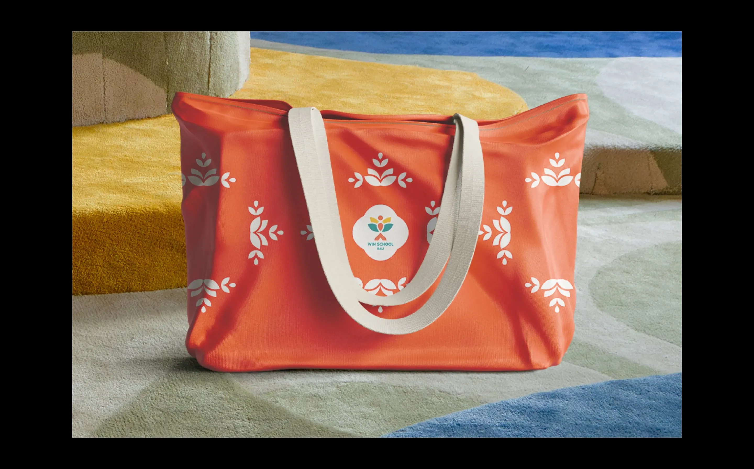
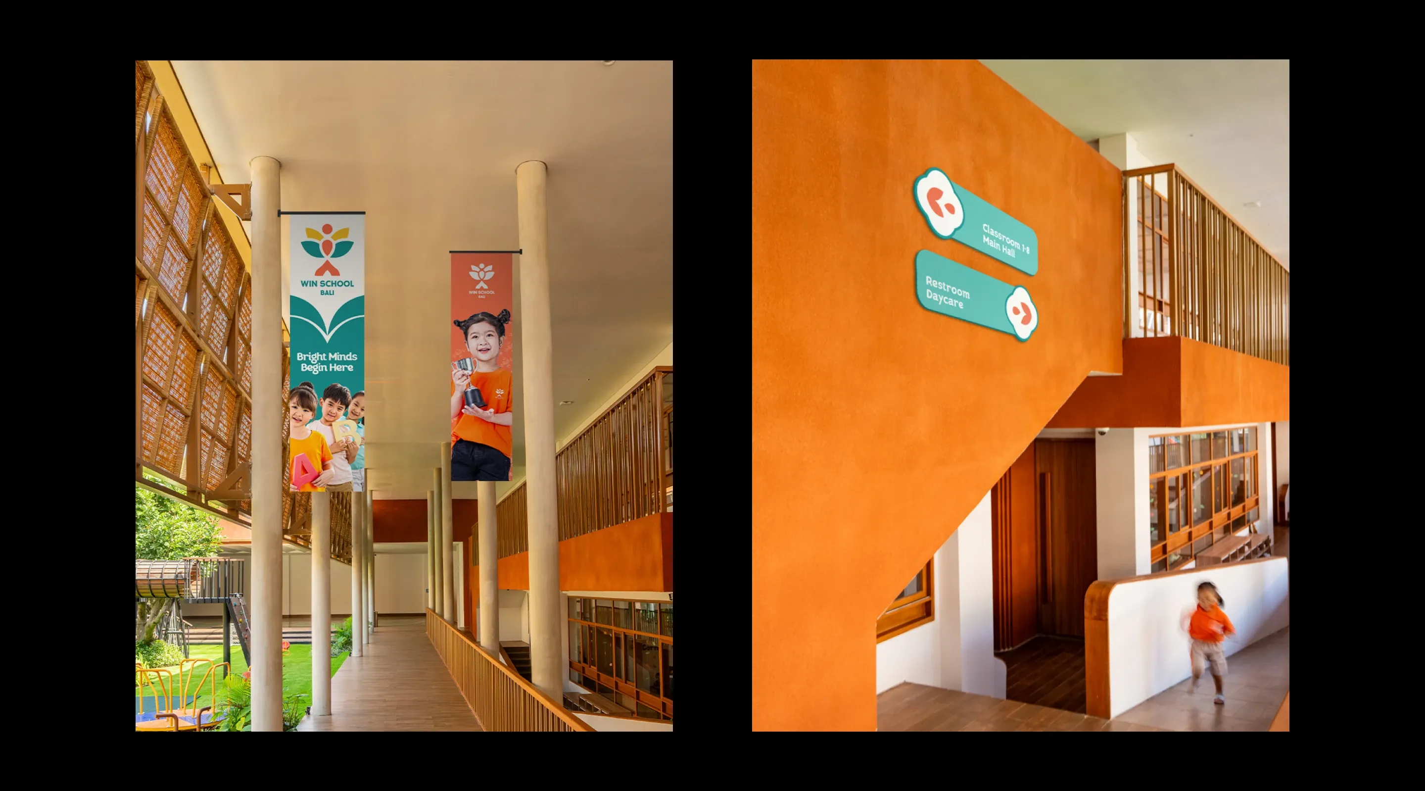
Branding consistency across all touchpoints is key to building trust and recognition at Win School
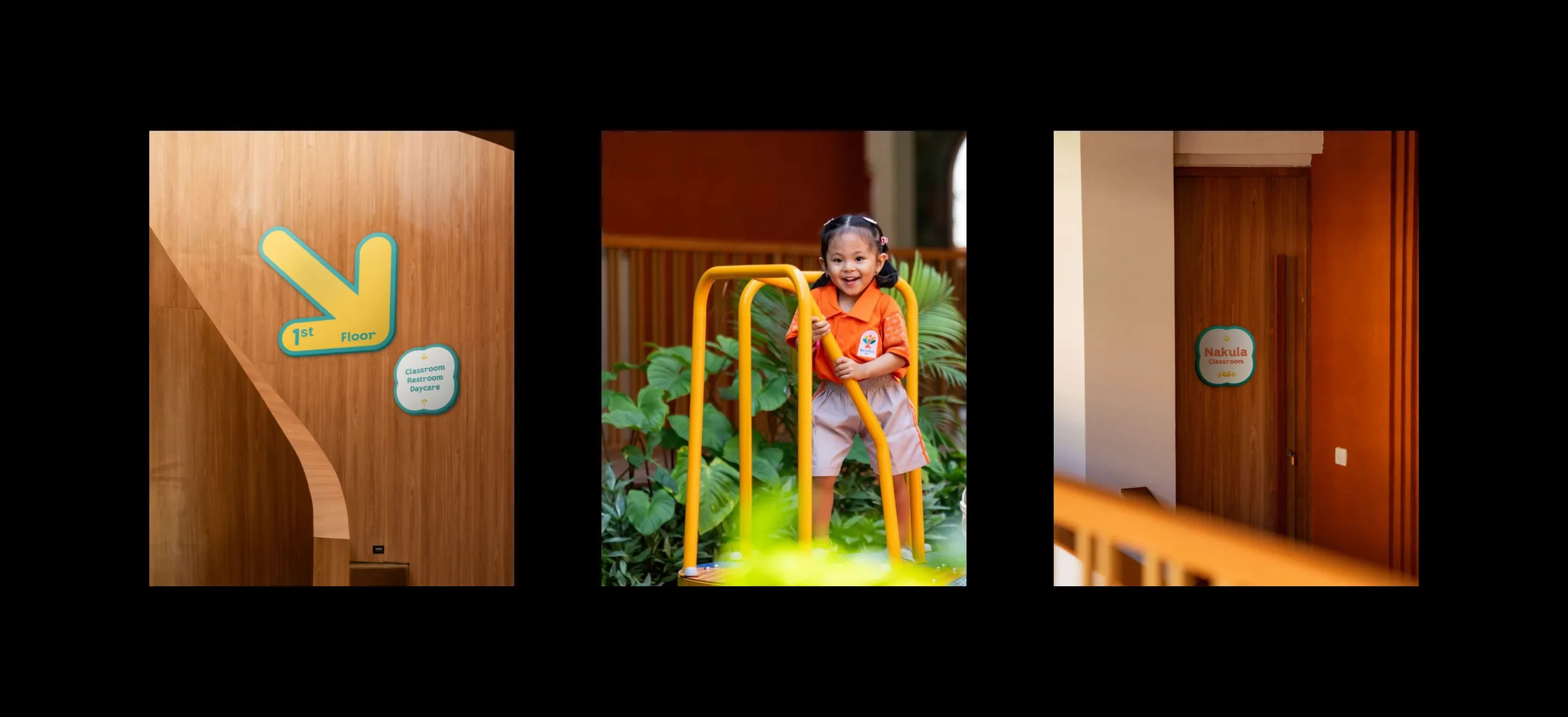
When developing visual branding for educational institutions, marketing materials are essential, and signage plays a vital role in shaping that experience. From the moment visitors come, the signage reflects our brand identity with clarity and warmth, using our signature colors, typefaces, and iconography. Every piece of signage is designed to feel cohesive and aligned with our values of clarity, joy, and child-centered design. This consistency not only strengthens our visual presence but also helps create a welcoming, navigable environment that reflects the heart of Win School in every detail.

©LAPOMPS Studio.