©LAPOMPS Studio.
LAW FIRM
BRAND IDENTITY

PROJECT SHEET
Client
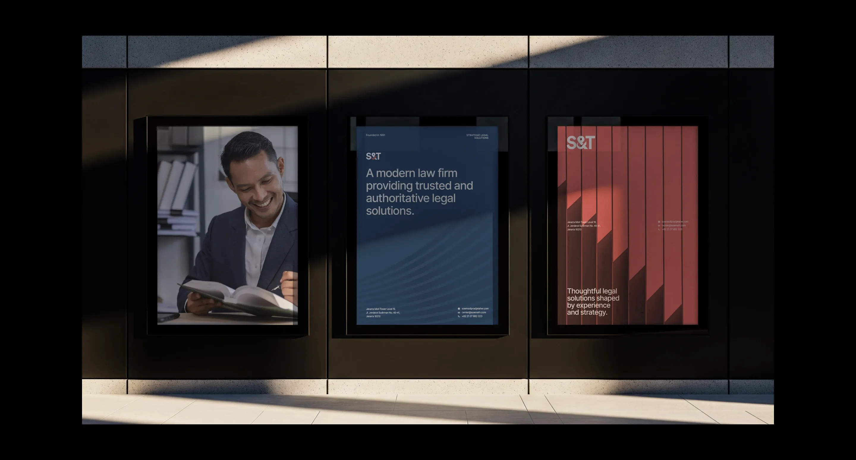
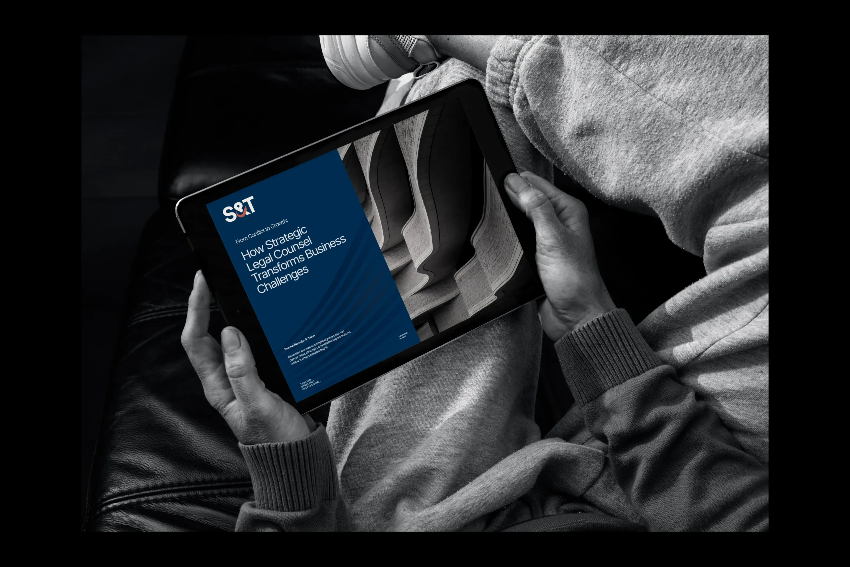
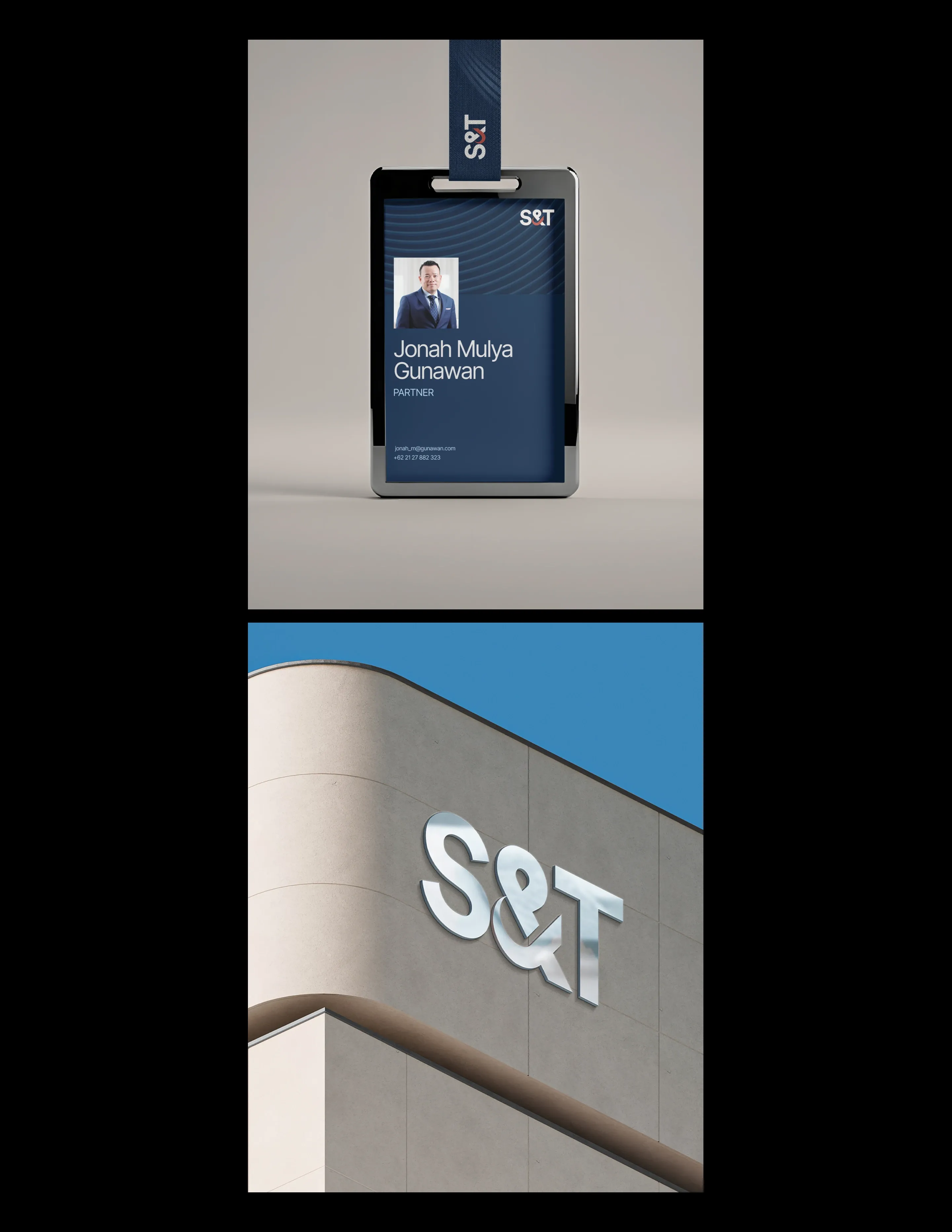
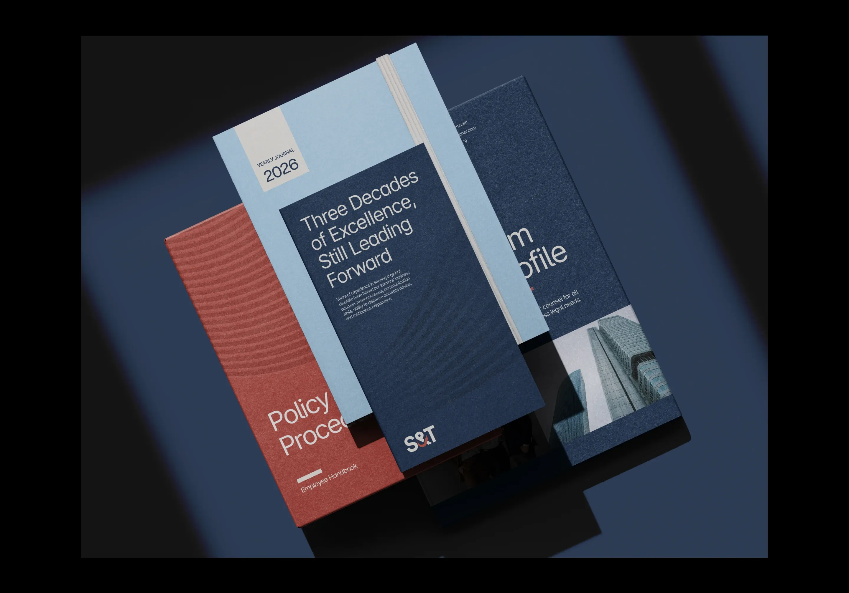
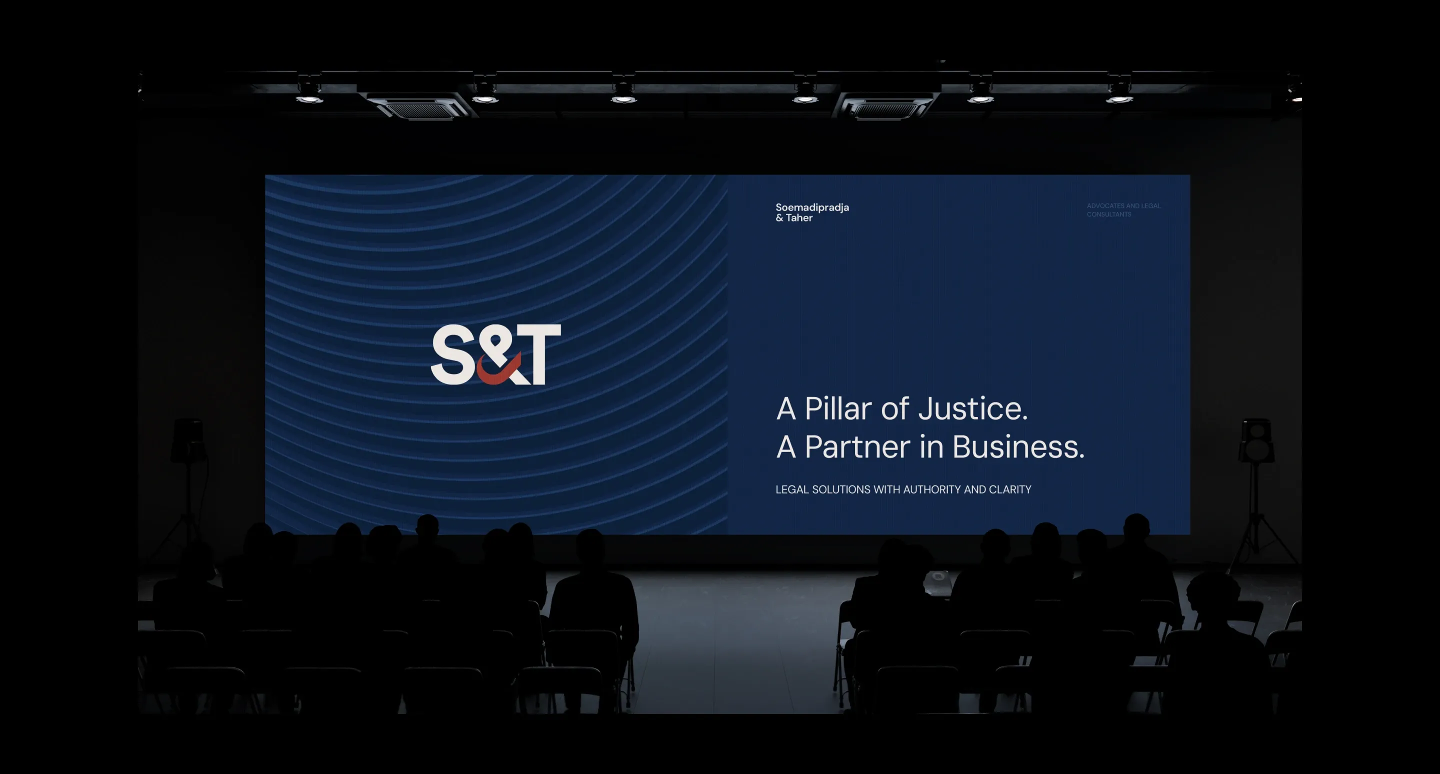
SOEMADIPRADJA & TAHER
Industry
LAW FIRM
Project Type
BRAND IDENTITY
Discipline
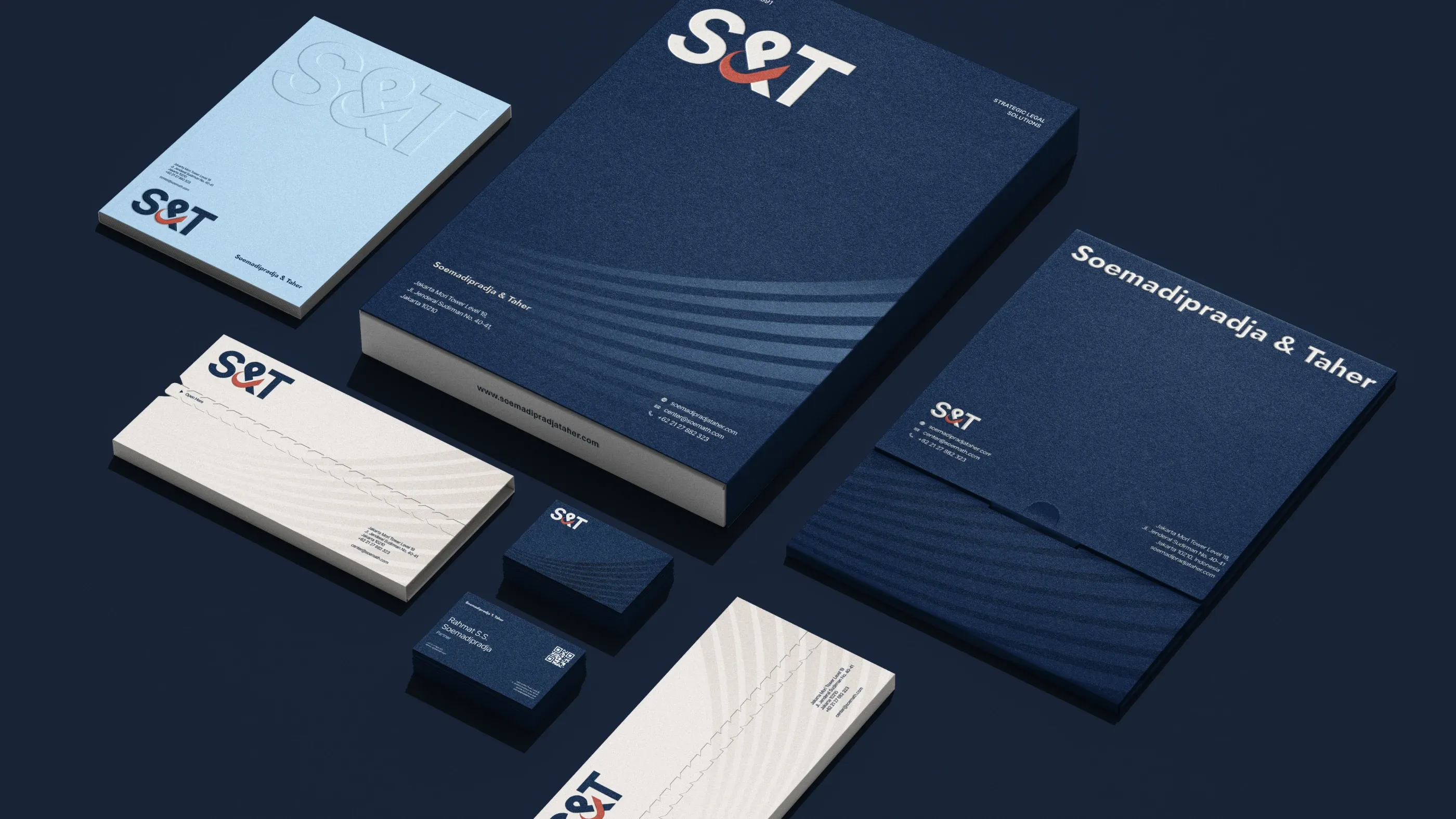
Logo DesignBrand Style DirectionColor SchemeTypographyPrint and Marketing Collateral
Built on three decades of dedication, Soemadipradja & Taher is a leading strategic law partner known for expertise and excellence.
Project type:
Law firm branding
By delivering forward-thinking, timely, and accurate legal strategies through experienced legal counsel, they help clients navigate Indonesia’s dynamic business environment while fostering enduring trust with organizations across Indonesia and worldwide.
As the firm enters a new growth phase, we shaped a brand identity, honoring legacy while embracing the future.
In creating the logo, we aimed to craft a mark that remains highly professional while carrying a strong sense of meaning and intention. The form is designed to feel refined and clear, reflecting a balance between simplicity and depth, where every element is shaped with precision and guided by thoughtful structure.


Designed to resonate with the next generation, the identity positions the firm as established yet forward-evolving.
The overall look feels modern, combining clean visual elements that reflects the firm’s forward-thinking approach while maintaining a sense of credibility and professionalism, making the new identity both relevant and adaptable so it continues to resonate with audiences today and remains impactful for years to come.


the new Refined approach reflects professionalism, forward-thinking, and decades of integrity.
Every element of this branding is crafted to stand out and remain memorable, from the distinctive color palette to the logo and the cohesive overall look and feel, all working together to create a strong visual identity that captures attention, reinforces recognition, and reflects the S&T’s character with clarity and consistency across every touchpoint.


©LAPOMPS Studio.