Logo Design, Brand Style Direction, Color Scheme, Typography, Packaging Design, Print and Marketing Collateral
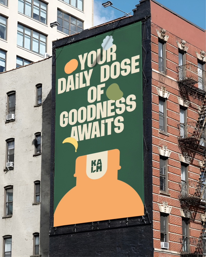
KALM
Project type: Healthy food & beverage branding
A lifestyle brand built on the belief that wellness should be inclusive, motivating, and accessible to all
More than just a café, Kalm is a wellness-forward brand designed to inspire healthier choices for everyone. It combines wholesome, nourishing offerings with an uplifting environment, where individuals feel truly welcomed and supported in embracing a more balanced and fulfilling lifestyle. Kalm invites all to join the journey, offering encouragement and a sense of community every step of the way.
Living well is a personal journey, and Kalm is here to guide you with support and encouragement through each step
Through the visual identity concepts developed for Kalm, we highlight the vibrant spirit of healthy living in a cheerful and joyful way reflecting the fresh, revitalizing experience of nurturing both body and mind.
Redefining the way healthy living is communicated by making it feel joyful, light, and easy to embrace
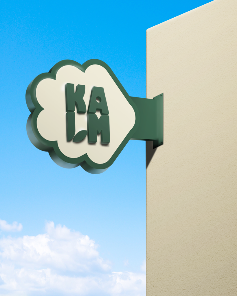
For the logo, we aimed to capture the essence of a healthy lifestyle that is deeply rooted in Kalm’s core values. The circle within the letter “A” subtly evokes seeds or oats, emphasizing the focus on nutritious, plant-based ingredients. Meanwhile, the letter “L” has been intentionally designed to resemble a human form intertwined with a leaf—signifying the harmony between body and nature. Altogether, the logo elements work in synergy to communicate Kalm’s dedication to wholesome living and mindful eating.
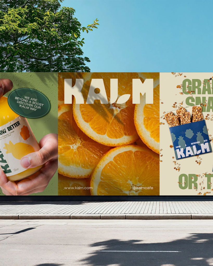
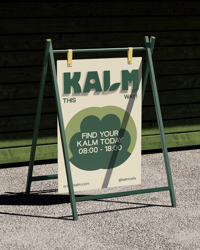
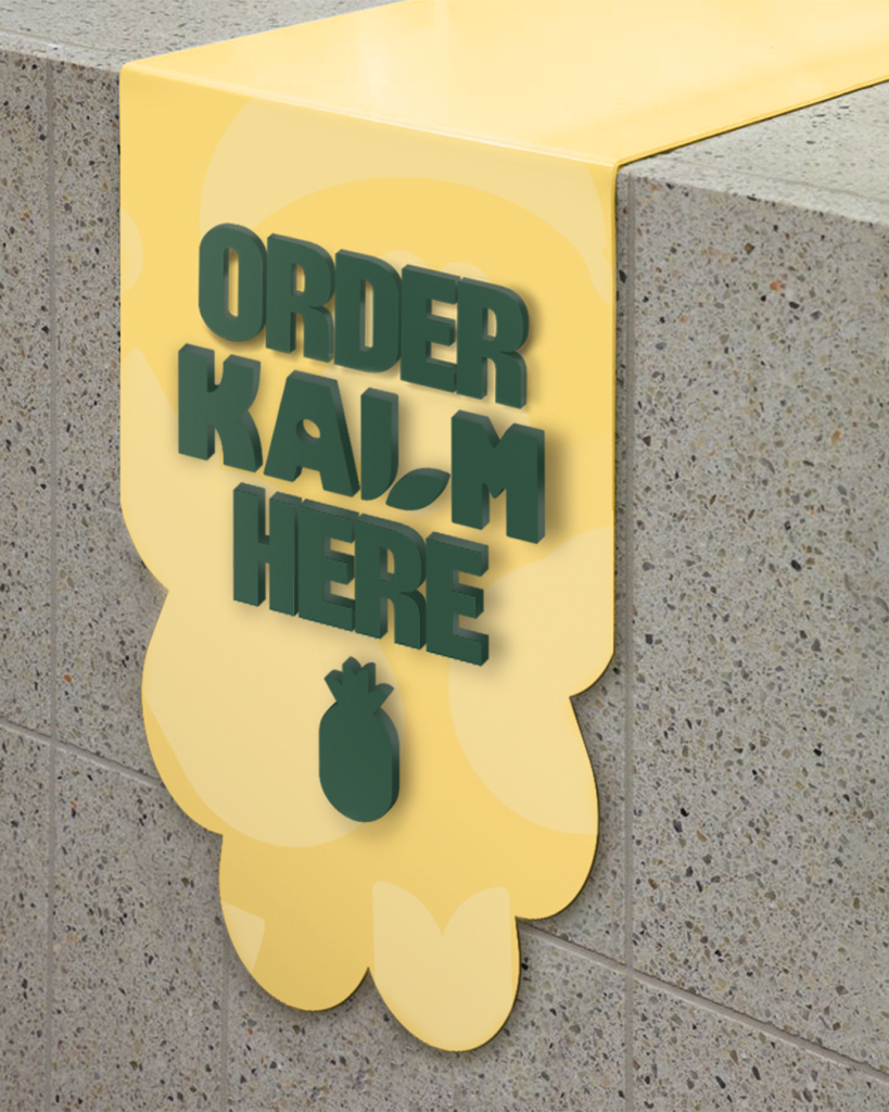
In terms of color, Lunar Green is chosen as the primary expression of the brand’s identity. It conveys freshness, calm, and natural energy, perfectly aligning with Kalm’s purpose. This green tone is the preferred choice for most brand applications. However, when placed against dark backgrounds or in design contexts where contrast is needed, Almond White serves as the alternative to maintain legibility and visual impact. This flexible yet intentional approach ensures that the brand remains recognizable and cohesive across various platforms and mediums.
Through fun and vibrant visuals, Kalm shows that living healthy doesn’t have to be complicated or boring
Every element of the brand, from the logo to the color palette and typefaces, has been crafted to reflect the values of clarity, authenticity, and approachability. Together, these visual components work harmoniously to create a consistent and memorable brand identity that not only feels fresh and engaging but also communicates the purity and quality of Kalm’s offerings. Through this cohesive identity, Kalm positions itself as a brand that is not only nourishing but also genuinely thoughtful in every detail.